Heľenine Oči

Heľenine Oči is a seven-member band from Prešov, active since 1999.

Project Overview


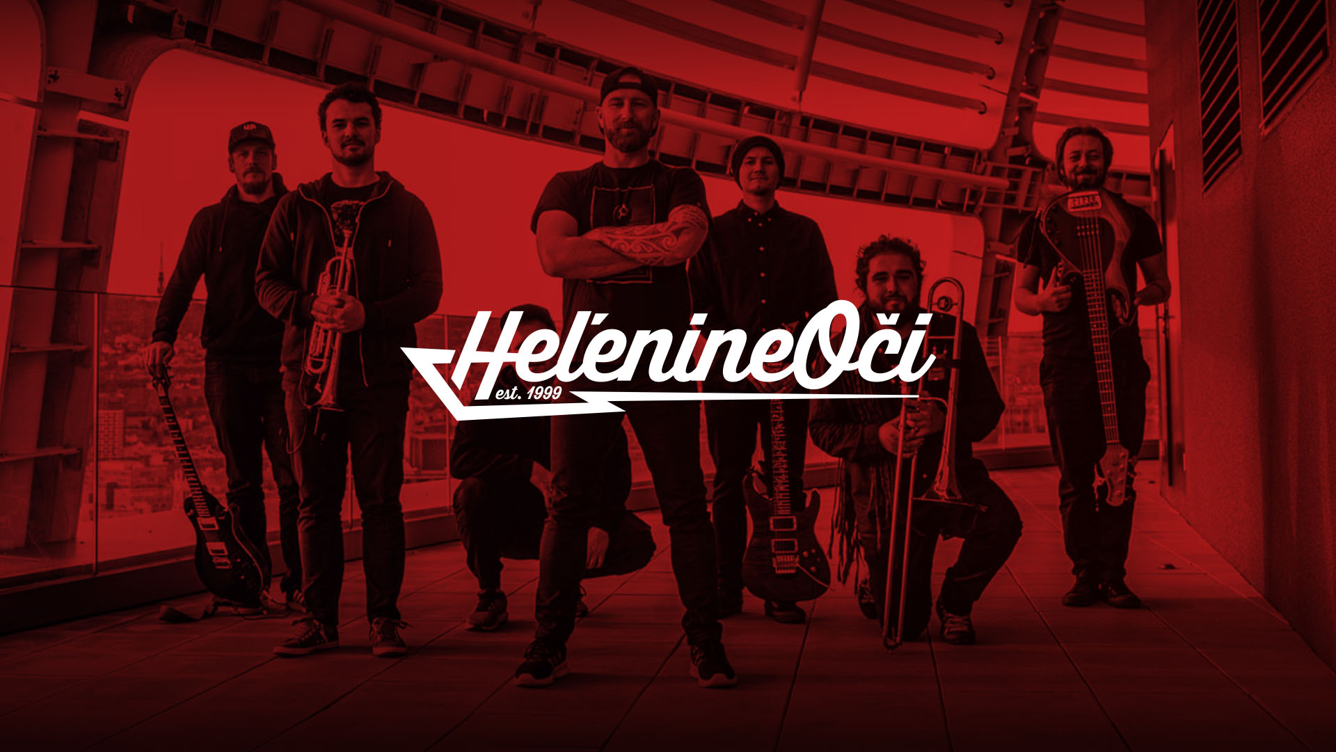
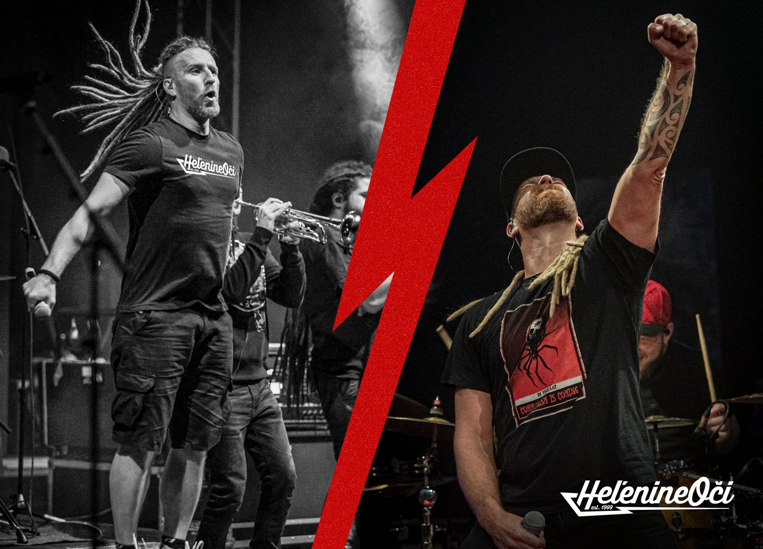
Heľenine Oči is a long-established Slovak band from Prešov, active since 1999. Known for blending rock, ska, reggae, folk, and metal, the band has built a strong reputation around energetic live performances and a genre-defying sound.


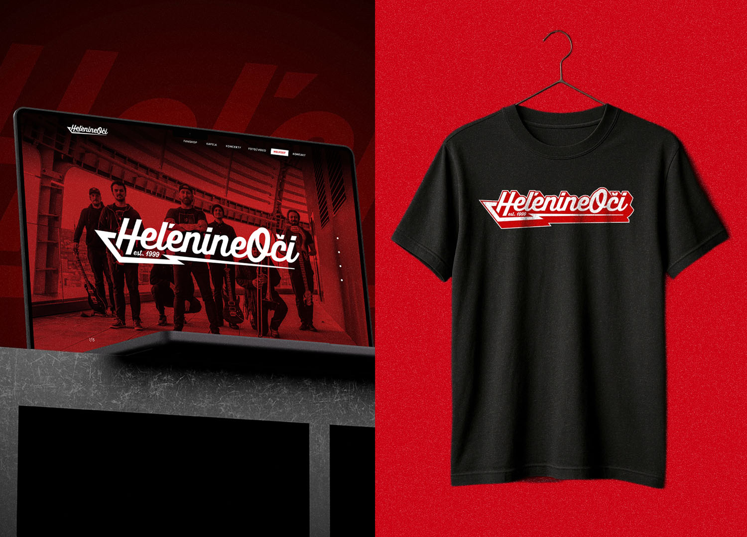
With over 100 live shows per year, the identity needed to work primarily in real-world environments — on stage, on the road, and through merchandise — while remaining clear and recognizable across digital platforms.


The Problem


Heľenine Oči previously relied on a highly illustrative and visually complex logo. While expressive and effective as artwork for merchandise and posters, it lacked the clarity and flexibility required from a core brand mark.


The logo was difficult to scale, inconsistent across applications, and too detailed for everyday digital and branding use. As a result, the band was missing a simple, unified, and functional logo that could serve as a strong foundation for a long-term visual identity.

The Goal


The goal of this project was to create a logo that would be minimal, instantly recognizable, and adaptable across all brand touchpoints, while still preserving the handwritten character associated with the band.


The challenge was not to reinvent the identity, but to distill it — simplifying the form without losing personality, energy, or musical attitude.


The Solution


The final logotype is built around a custom script form designed to balance two key forces: the human, expressive flow of handwriting and the sharp, aggressive edge of rock music.


The structure subtly echoes the shape and tension of an electric guitar, introducing direction, movement, and a strong horizontal base. This approach allows the logo to feel musical in shape rather than decorative in style.

Outcome


By removing unnecessary visual complexity, the logo gained clarity, scalability, and longevity. It now works seamlessly across merchandise, tour vehicles, digital platforms, and small-scale applications, while preserving its character.


The result is a clear, functional visual foundation that supports consistency and respects the band’s history.


Final Thoughts


This project was not about making the band louder, but clearer. The logo respects their past, preserves their script-based character, and introduces a rock-driven structure that allows the identity to function as a system — not just artwork. It doesn’t compete with the music. It supports it.

Next Project

Back To Top