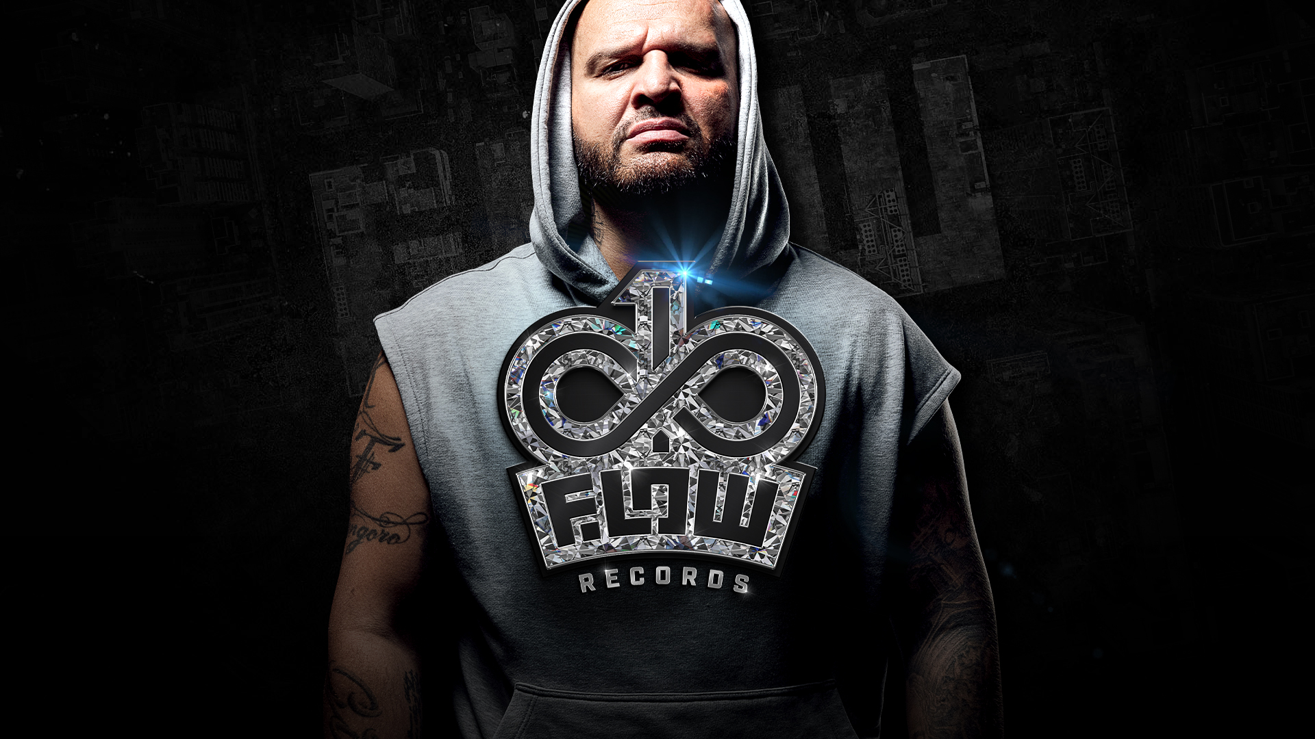
Infinity & one flow records
is the publishing label and authorial brand of Rytmus — built on the idea of continuous evolution, personal expression, and absolute control over flow, creation, and direction.
The brand represents an endless creative process, where there are no compromises — only a clear identity and one authentic voice.
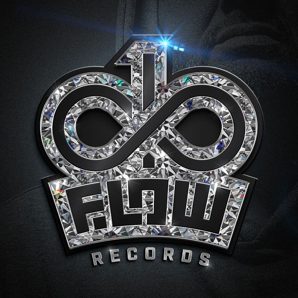
Logo concept
The Infinity & one flow records logo is a visual translation of the brand’s philosophy:
Infinity — a symbol of constant movement, growth, and creation without limits
One Flow — a unique style, signature, and voice that cannot be replicated
The combination of these two principles creates a contrast between an infinite process and a singular, unmistakable identity.
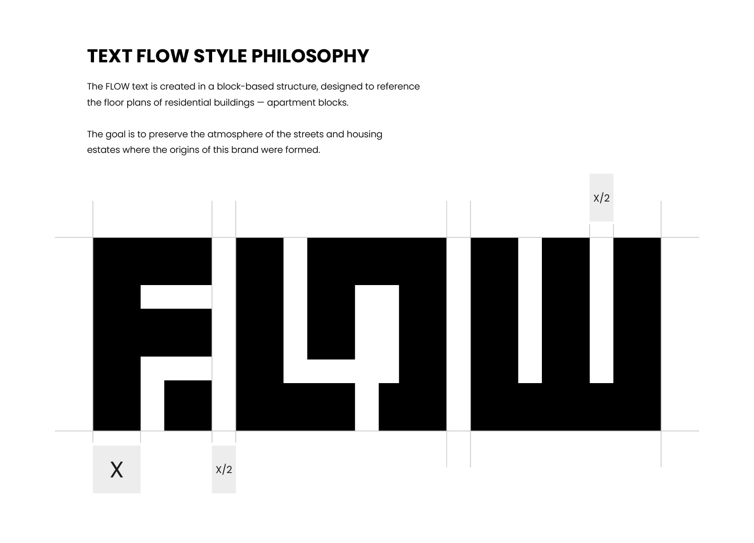
Typography
The typographic approach is minimal, raw, and confident, without unnecessary effects — just like authentic flow in music. It is built on strong letterforms, high readability, and a timeless character, avoiding trends that would distract from the message.
Symbolism & Meaning
The logo treats simplicity as strength, not limitation. Nothing is redundant, every element has a clear purpose, and the brand communicates attitude rather than decoration. The visual identity is designed to outlast trends, eras, and shifts in sound.
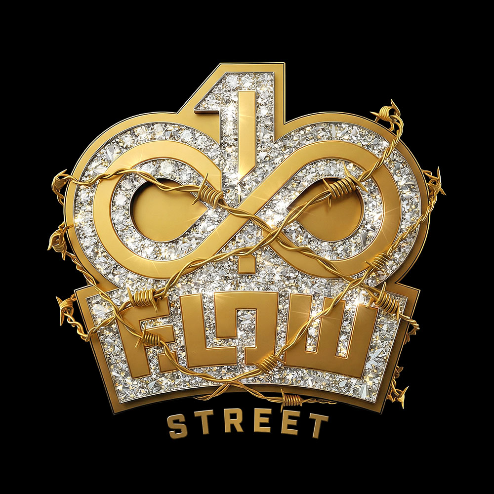
Practical Application
The logo functions as a flexible and durable visual tool, ready to live across the entire brand ecosystem — from music releases and cover art to merchandise, digital platforms, publishing materials, and overall visual brand communication.
Conclusion
Infinity & one flow records is not just a name. It’s a statement. A brand built on authenticity, continuity, and a clear creative signature — exactly like the work of Rytmus.